 'The “Weather Bomb!” and “I Love Doris” stickers were the most popular amongst the public. I think this was because they were more colourful than the other stickers that I had made. Or, maybe the use of phrases made them more appealing?
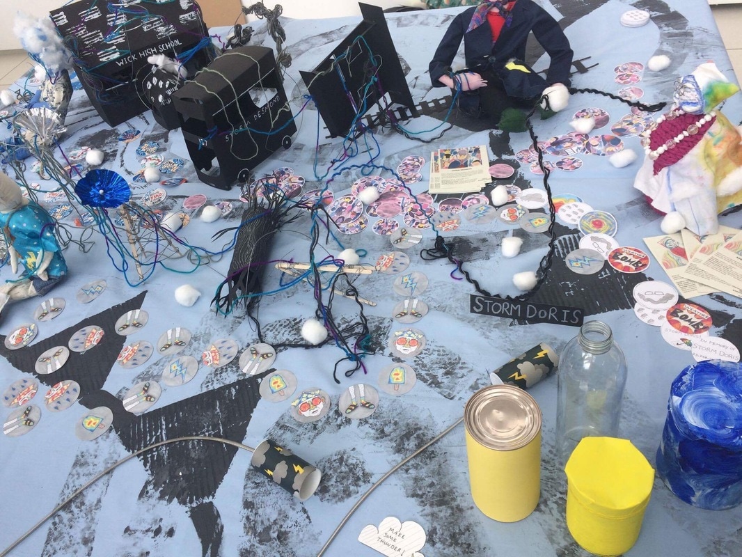
Throughout the day, we decided to place and replenish our stickers and flyers in moderation, with the presumption that they may be quite popular, and we didn’t want them to all disappear at once! As a final decision, we chose to each wear rain coats. We thought this would enhance the fun and humorous narrative of our display, and also make us appear more approachable to the public (encouraging them to ask us about our work). One thing that was difficult to consider before the day of the event, was the placement of our table, and how this affected the type of interaction from the audience. For example; the way in which our table was positioned (within a row of tables), meant that the audience were unable to walk around the whole table, but only view the table from the front. As a consequence, we had to rethink the placement of the objects in our display. Another oversight was the practicalities of our poster- as we made our poster from fabric, the fabric wouldn’t stick to the blue tack on the walls. Fortunately, there was some Velcro available that we borrowed. The Velcro was successful at holding up our poster. Halfway through the day, we noticed that few people were actually taking the flyers. As a result, we chose to switch the positioning of our flyers from being next to the corresponding characters, to spreading them out at the front of the table. This made a big difference, as people started to be less apprehensive about taking the flyers. We think the audience were unsure whether to take the flyers at first, because they were positioned with the display objects. This, plus the fact that the audience couldn’t get around the table, might have caused the audience to misinterpret the purpose of our flyers.' -By Beth Griib
0 Comments
I have decided to make this doll very simple and traditional looking. Using fabric to make all parts of this doll seems like a good idea because it allowed me to work quickly and efficiently. The final doll looks very clean and professional. As a group, we have decided that we are going to make a dimensional representation of a hurricane as a person, which hasn't specified from which material she has to me made. I had to make sure that she is big enough in size, so that she doesn't blend in with smaller objects displayed on the table. Those dolls will be the main focal point therefore they need to be noticed as soon as someone walks to the table. 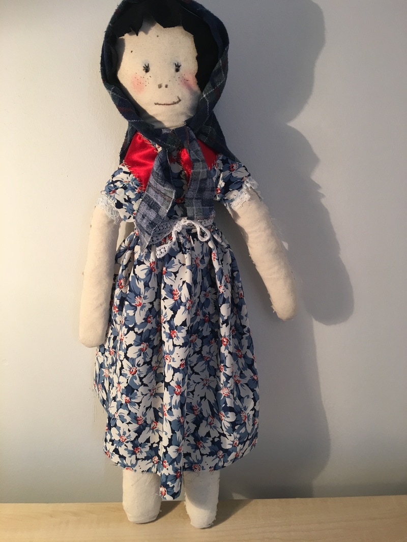 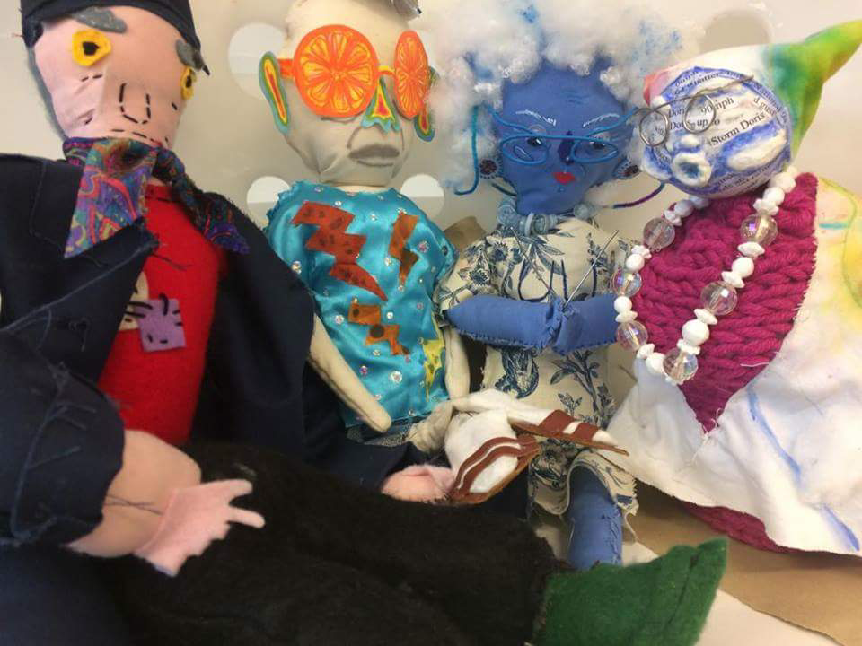 'Overall, we received a lot of positive feedback on our display, as well as a few things we could improve upon. The audience liked that our display was visually interesting- there were plenty of things to look at and pick up. They also liked the storm instruments, as a tool of interaction. Our tutors recommended that we make the instruments visibly separate to the rest of the objects, e.g. by painting them with a colour that doesn’t blend with the display, such as red. As a group, we have agreed to make more storm instruments, as they are relatively simple to make and proved really popular with the audience. -One thing that was brought to our attention, was that the audience were unsure about which pieces of the display they could touch. This prompted us to consider ways in which we could visually indicate the separation between “display pieces” and things that the audience can pick up/ take away. Our tutors suggested we leave a border of negative space, that separates the display pieces from the audience, while the stickers and storm instruments are closer to the edge of the table. I think this is a good suggestion, and believe it would avoid the audience’s uncertainty. -Scale was also mentioned- a couple of people suggested that it would be nice to have the storm characters bigger than the other pieces on the table, so they appear more dramatic. I think this is a really good suggestion, although I’m not sure how achievable it would be to change this. Unless we re make the paper objects so that they are really small, it would be difficult to change the size of our storm characters within the time we have left. -Our audience really liked the fact that we had focused on the characterisation of storms, and said that it would be nice to focus more on the characters themselves. For example; somehow incorporating the storm’s names in bold, either on the display or on our poster. As a group, we appreciated this suggestion, and have decided to place the storm’s names on the poster. We also intend to put the names on some of the paper objects that the storm “destroyed”. -Poster- When discussing our poster, our audience liked the bold, colourful design. They also recommended that we integrate the storm names. This will make our display sound more exciting- as if advertising something that feature “storm doris, ian, barabara, etc”. This puts more emphasis on the storms, making them the focal point of the display. Our audience also advised that our poster could change throughout the day- for example; the patterns (representing that of a weather map) could change throughout the day (e.g. by adding/removing pieces), thus mirroring the ever changing patterns on a weather map. -Arrangement of stickers- Our audience said they would like to see the stickers laid out in a more interesting way, rather than just randomly scattered across the table. For example; they suggested we lay them out in a trail, or beside each storm character. We liked this suggestion and will adapt our display as a result. -Flyers- our peers liked the concept of our flyers, although they suggested we could make them slightly smaller, (e.g. a6 instead of a5). This way, they would be more like top trump cards, allowing the audience to pick them up, and possibly even play a game with them. Again, we liked this suggestion, and will reduce the size of our cards to a6.' -By Beth Griib  It was important that we covered the tables at the Forum with something so that it plays well with whatever we decide to display on top of it. A piece of fabric seemed like a good idea and its easy to print on top of my but also it is easy to transport it to the actual location. Printing was the most efficient and effective way of adding image on top as we just used the shame shapes, printed multiple times next to each other in order to make a pattern. We decided to use only grey tones for the main tablecloth as we were worried that bright colour would take attention from the objects on top of it. The patterns are shapes we picked from the podcasts and maps, which directly link to the hurricanes. As for the poster, the same blue piece of fabric with colourful prints was used, which complimented the whole idea. In this case we allowed ourselves to use bright colour, as the poster wasn't located directly next to our table, so it wasn't clashing. Again, the shapes and colour was taken from the maps and podcasts. 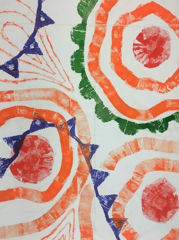 I have decided to chose this hurricane mainly because of its old fashioned name and the fact that it waa the strongest hurricane in the 1969 Atlantic Hurricane season. and caused severe damage to the Lesser Antilles, the Greater Antilles, and the East Coast of the United States, especially Florida, in August–September.  Here are the prototypes that my group has made. I am not too sure that the cages idea is the best as it separates the viewer from the main thing, which are the dolls. I think that this idea could be more interactive and more welcoming. The dolls are almost becoming the background as the boxes are things that you see first. Obviously all of those objects would be made out of more stable materials such as fabrics and wire. It helps to see how they are going to be displayed on the table and how much more space we have to fill. In order to represent our theme better we have to focus more on the subject that we got given which is Weather. Making it too complicated makes it hard for the viewer to understand and in the end, interest them.
We have been showing hurricanes as people therefore it feels best to just continue with this idea and try to expand on it. Within our society, bad people gets punished for breaking the law. We have used the fact that those hurricanes cause so much damage on a huge scale and represented it in a humorous way by putting them into cages. I think that even though this is quite serious subject we would gain interest from people by doing it through a playful way. Placing puppets in cages; 'locking up Doris the hurricane' 'Desmond-wanted' 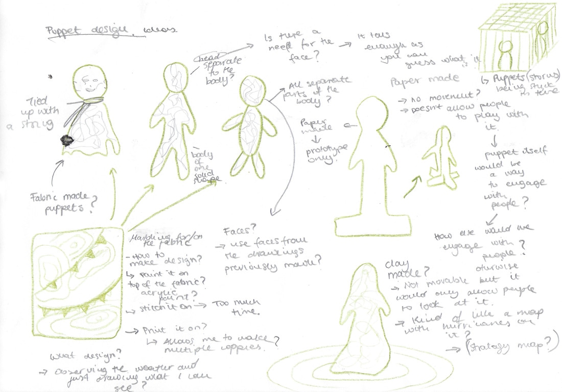 The initial idea was to represent storms through textures and patterns. We were going to print textures on different pieces of paper which we would than hang from the top. Whenever someone walks pass, grabs one paper and keeps it with them. This idea would represent the process of storm and how storm or hurricane comes and leaves. Underneath it we would make models of houses and buildings. Some of them would be destroyed and some of them would have little papers with facts written on them for people to read. It would be interactive as people would participate in 'taking away' the storm but at the same time having something with them as a reminder of our work. 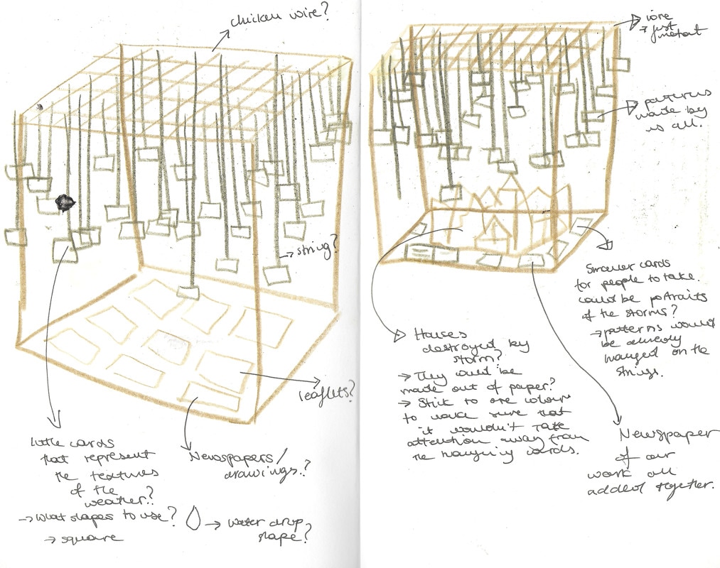 We all come to conclusion that this idea doesn't resemble all of our skills. Therefore we have decided not to go with this thought as it would be hard to create the 'ceiling' from which we would hang things from but also because it felt like the idea was too simple. 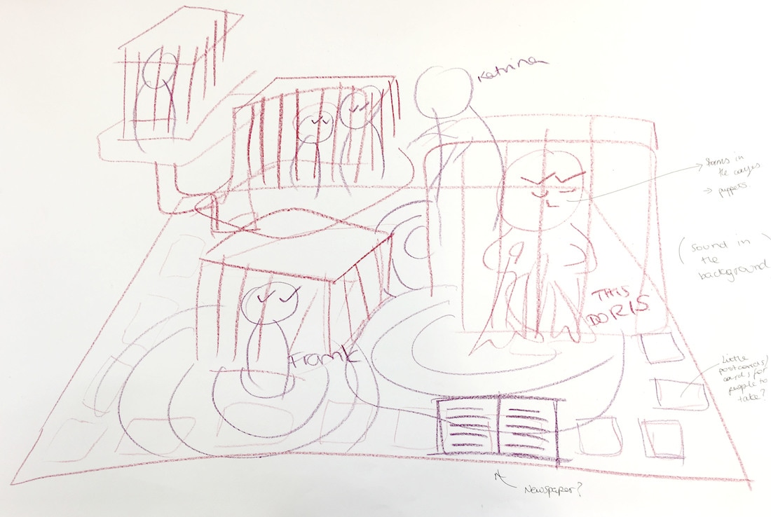 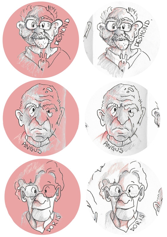 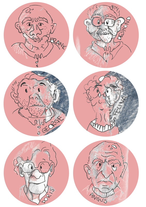 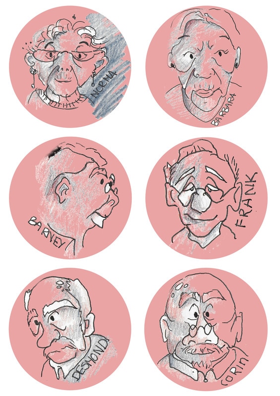 Here are my final stickers. I think that having something that people can take is very good idea as it leaves public with something of ours. It's a little gesture that could remind them about our project and how we have personalised all of our characters.
Here are some more of the quick sketches that I have made. I am trying to draw them in slightly different ways, because i am not sure which 'style' of the drawing would be the most appropriate for the actual sticker design. I am happy with the top left ones as they are simple but still have colours added to them. I think that the lines are more fluid and confident making them look more alive. 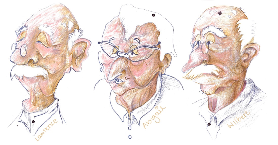 (A4 drawings, watercolour and coloured pencils)
I think that those illustrations would look very interesting if I made them into animations as they have very specific face features. I can image how they would sound and how they would move. I hope that I distinguished their personalities through their face expressions. I though that it would be appropriate to do quick printing as it fits with the idea of storms and hurricanes. It's hard to control how dark or light the image would be therefore it is unpredictable just like weather. I think that messy line work and continuous line drawings were more apprioprate to show the personalities of the hurricanes.
|
Archives
May 2017
Categories |


 RSS Feed
