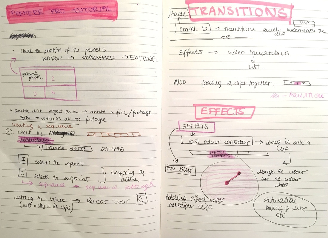
|
I am not particularly happy with the way I did this short film but I throughout this process I have learned a lot new techniques and processes.
0 Comments
The purpose of this workshop was to explore the form and movement of the figure through fast drawing exercises. The aim was to remove hesitation when drawing fast but also to experience fast decision making when it comes to composition and colour. Expressive Mark-making with malleable materials (charcoal) inhibit the planning of compositions and drawing spontaneously. I have undertaken exercises that have focused on: -Form and movement -Negative space -Colour as compositional shape -The totality of a pose -Gestural and fast mark making -Drawing without looking at the paper -Drawing from memory (eyes closed) -Drawing with weaker drawing hand -Developing confident line work  Drawing figures around me when turning around. 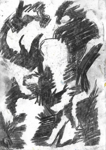 Drawing negative space in-between figures. 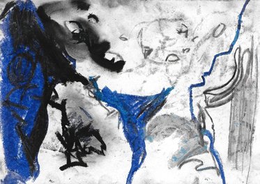 Looking down at my feet and drawing whatever I could see. 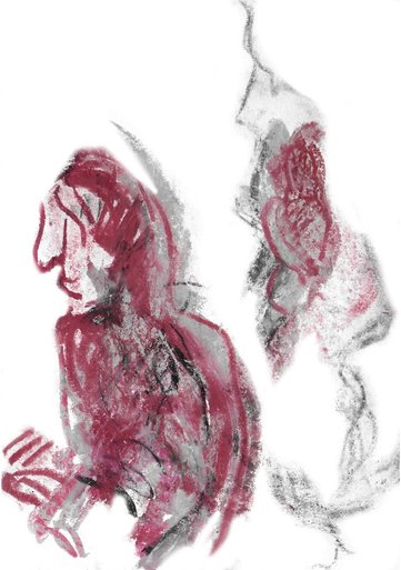 Drawing in perspective using 2 colour 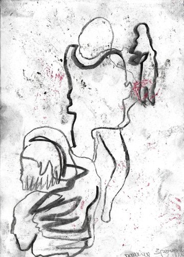 3 figures 1 continuous line 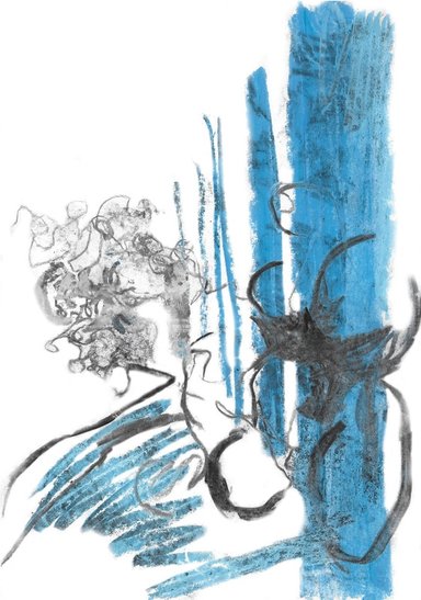 Blue charcoal: raw of columns, Black: figures represented as circles 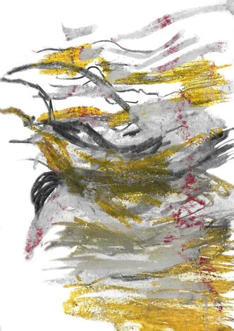 Drawing only horizontal lines seen around the room, on figures only
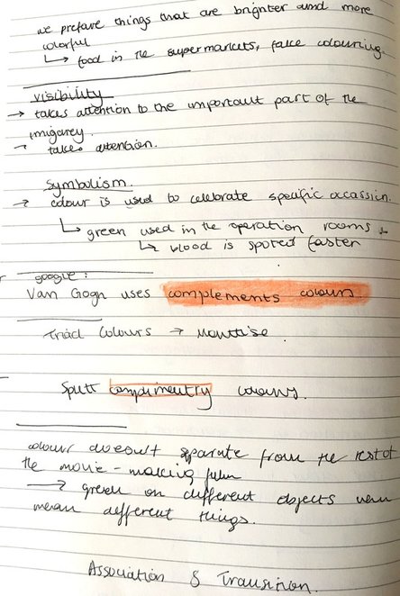
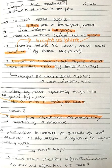
As my quick preparation before the lecture I have been drawing people in public spaces. I sat in a cafe and drew as many compositional variations as I could. I believe that this would help me get idea of how to place shapes on the paper to represent distance. This skill would be usefull when making my film. 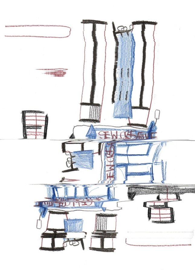 I have accidentally scanned one of the drawing wrongly because I opened the lid from the scanner too early and the image came out modified. Even though it was a mistake it turned out to be a very good way to develop simple drawings. I have managed to repeat the process and create even more interesting shapes and patterns. When scanning I have been moving the images vertically and horizontally which made it look like reflections in water. 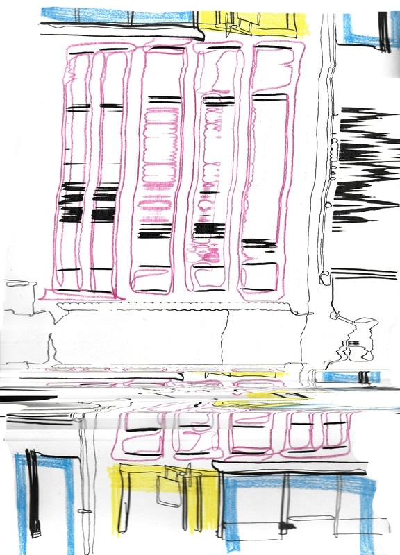 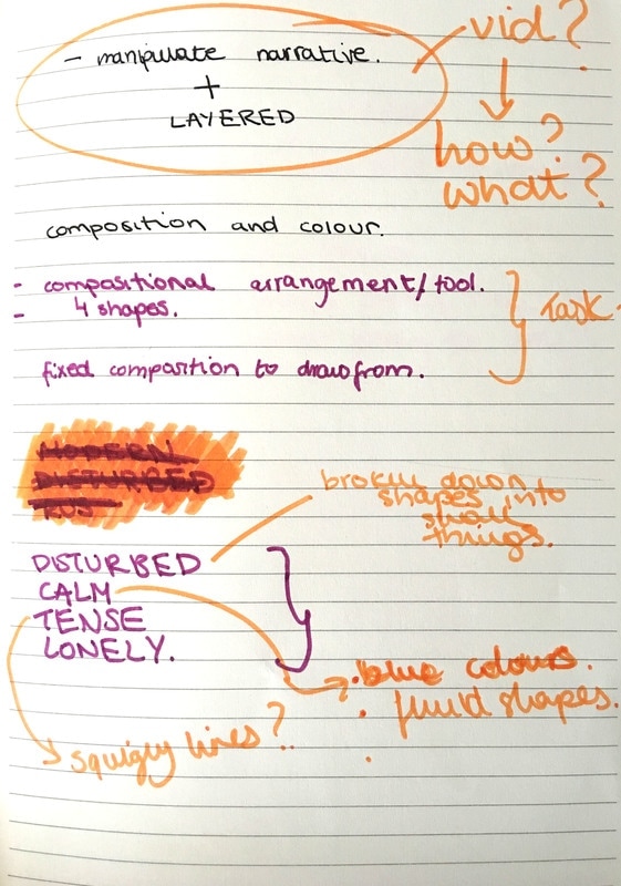 Cutting out windows and using it to select composition has restricted me to stick to shape that I am not used to, which in the end brought in more interesting views and perspectives. As I have been drawing outside I had to make sure to work fast and efficiently. I had broaden my usual way of looking at the 'square' composition. Drawing became easier as the composition was already created by looking through the window therefore I directed all my attention to colours and mark-making. 4 Words: Tense Disturbed Calm Lonely Few challenges that appeared in the process would be the right choice of colours that truly illustrated the chosen word. I kept adding colours without properly considering the kind of effect they have on the viewer. I understand that it is important to know how to use tones correctly in order to manipulate the narrative, generate expression and connect with the audience. I haven't discovered how to do it just yet. Overall I found this workshop difficult. Now, i think that I should've taken very simple approach and plan my drawings with thumbnails before starting. Also researching artists such Paul Klee and Sonia Delaunay before the workshop would help me to understand the purpose of it better. 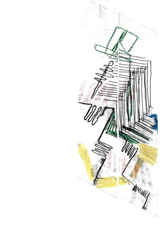 When I was sticking the tape on top I tried to use the lines from the previous layer as a starting points. When I was taking the tape off the paper I kept it on separate piece of paper to re-crate designs with chunks of drawings. It has made interesting compositions and colour combinations. I like the fact that you can’t tell which building is which. I guess it refers back to Norwich as the whole town contains modern and antique buildings. It shows the variation and uniqueness of town. I guess this is my interpretation of Norwich and how I see it. When I started peeling off the tape I have realised that sometimes the paper underneath was getting ripped. It didn't look like it did at the beginning. It left the trace of the things that happened in the past. 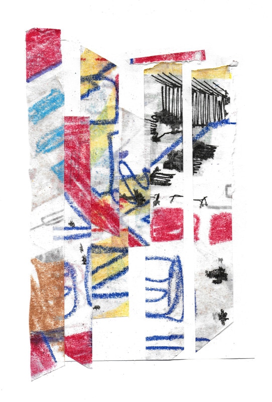 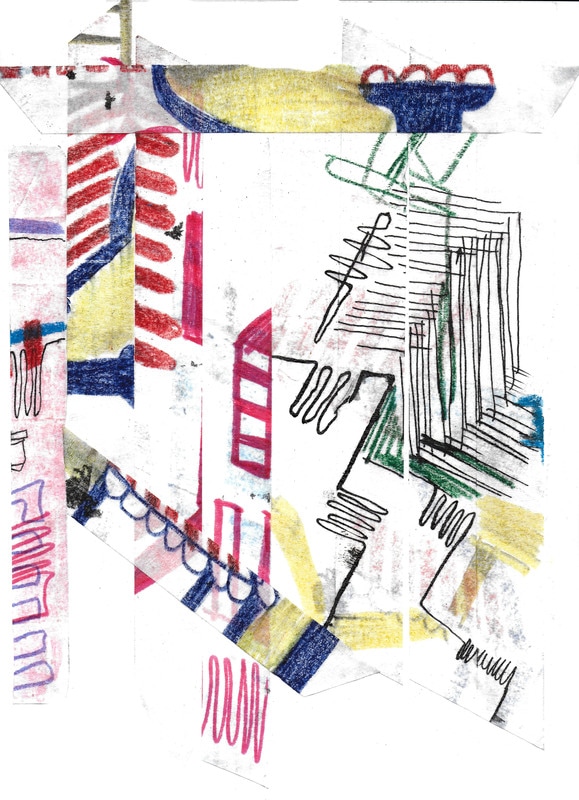 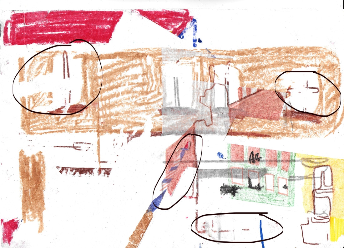 I have decided to use this technique of drawing parts of the buildings on slices of tape, which allows you to see previous layers that are underneath. I was looking for a way to show how the architecture around Norwich changes by cooperating new and old buildings together. In some cases old parts of the building are renovated leaving clashing line of new and old. New windows would be placed within Gothic buildings or roof tiles would be exchanged for the new ones. I have been working quite quickly and freely because the I was going to take the tape off anyway. I have been scanning it before putting more layers on top to make sure that I have the whole process recorded. When I played it all in a sequence you could really see how the architecture changes. Colours helped to emphasise parts of the buildings.  Notes from lecture with Nigel. Use of colour within the film and everyday life. We have been using colour to highlight certain information in maps, graphs, flags, language or even in what we chose to wear. It gives us sense of self and allow us to be a part of something bigger and stand by what we believe in. In some cases colour make us take actions. For example, when being at the football match, you wouldn't sit with the supporters of the red team when wearing blue T-shirt as it could cause an argument. I wasn't aware of how quickly we react to colours on everyday basis. It changes our mood and in the end it affects our days. We have made the most use of colours used in certain locations and at specific situations. For example, green sheets and clothing is used in the operation rooms as the red blood is more visible. As green is the complementary colour of red it keeps doctors mind in focus and allows them to concentrate easily. During this lecture I have learned the importance of colour in film as well as in everyday life. How is can affect the viewer and change their emotions. Colour on its own could be used to indicate the the surroundings and take tell some kind of information. It 'takes attention to the important part of the imagery'. If you use only black the image could be not as recognisable. 'Colour will affect how it's read' Talking about the right use of colours and the way it affects the image is slightly difficult without the use of examples. One of the famous paintings of the complementary colour that cough my attention would be the Café Terrace on the Place du Forum by Van Gogh. 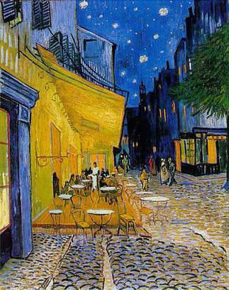 ' Complementary colours Two colours, placed side by side, will appear differently depending on which colours are used and what they are placed next to. The effect of this interaction is called simultaneous contrast. Simultaneous contrast is most intense when two complementary colours are juxtaposed directly next to each other. For example, red placed directly next to green, if you concentrate on the edge you will see a slight vibration. Your eye doesn’t like resting on the edge. The two complementary colour in their purest, most saturated form don’t sit well together, however, if you want to try and focus your viewer gaze on a particular part of the painting a knowledge of the ‘attraction to the eye’ can be used to great effect…' 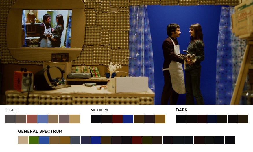 HOW CAN I USE THIS INFORMATION?
I have a bit more knowledge on how we react to colours and how we see it in relation to other object within the image, which allows me to make colour choices accurately. It manipulates the narrative. For example, blue tones could indicate sadness and loneliness but when we using yellow within the same image the whole context changes.Or a character in film have colour that relates directly to them which is applied in the background and/or on their clothes. If the saturation or the tone of the colour changes it's most likely that the character's mood has changed. Those small details are not very noticeable but it does affect how our mind receives the image. It is something I could experiment with when making my own film. |