|
Here are the prototypes that my group has made. I am not too sure that the cages idea is the best as it separates the viewer from the main thing, which are the dolls. I think that this idea could be more interactive and more welcoming. The dolls are almost becoming the background as the boxes are things that you see first. Obviously all of those objects would be made out of more stable materials such as fabrics and wire. It helps to see how they are going to be displayed on the table and how much more space we have to fill. In order to represent our theme better we have to focus more on the subject that we got given which is Weather. Making it too complicated makes it hard for the viewer to understand and in the end, interest them.
0 Comments
We have been showing hurricanes as people therefore it feels best to just continue with this idea and try to expand on it. Within our society, bad people gets punished for breaking the law. We have used the fact that those hurricanes cause so much damage on a huge scale and represented it in a humorous way by putting them into cages. I think that even though this is quite serious subject we would gain interest from people by doing it through a playful way. Placing puppets in cages; 'locking up Doris the hurricane' 'Desmond-wanted' 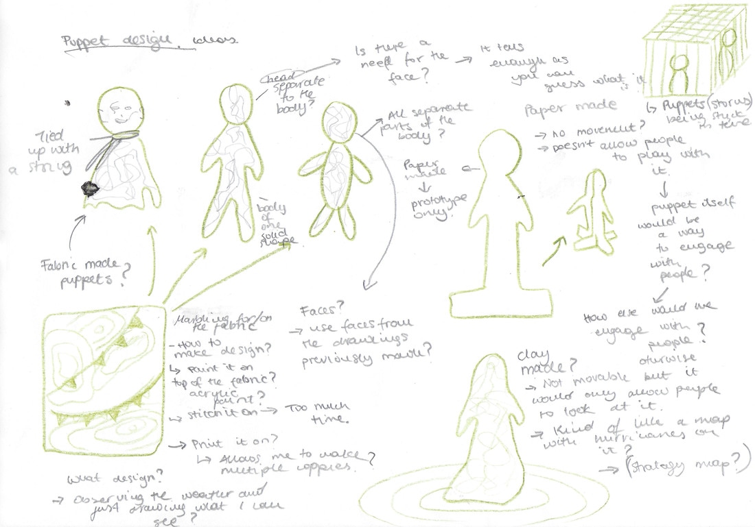 The initial idea was to represent storms through textures and patterns. We were going to print textures on different pieces of paper which we would than hang from the top. Whenever someone walks pass, grabs one paper and keeps it with them. This idea would represent the process of storm and how storm or hurricane comes and leaves. Underneath it we would make models of houses and buildings. Some of them would be destroyed and some of them would have little papers with facts written on them for people to read. It would be interactive as people would participate in 'taking away' the storm but at the same time having something with them as a reminder of our work. 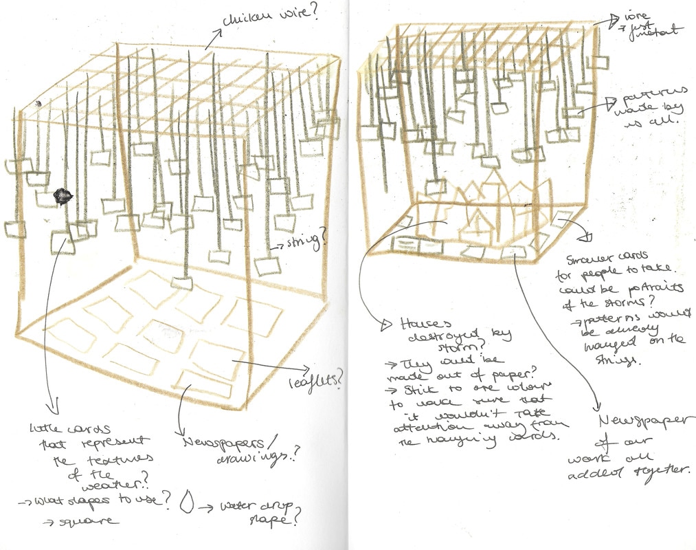 We all come to conclusion that this idea doesn't resemble all of our skills. Therefore we have decided not to go with this thought as it would be hard to create the 'ceiling' from which we would hang things from but also because it felt like the idea was too simple. 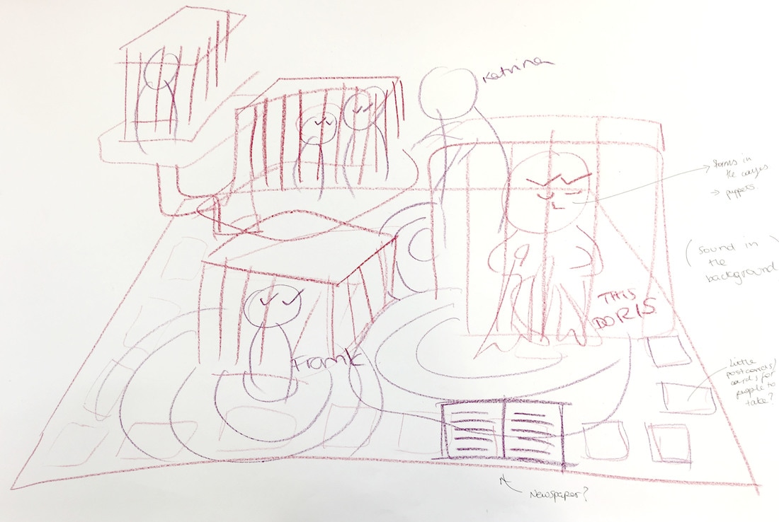 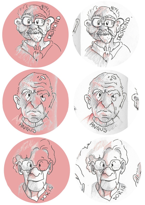 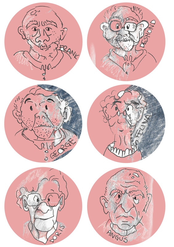 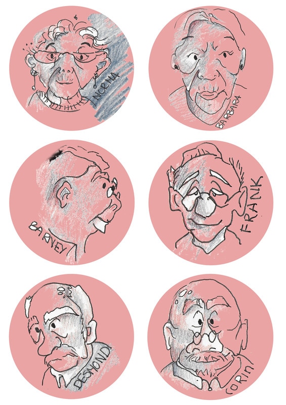 Here are my final stickers. I think that having something that people can take is very good idea as it leaves public with something of ours. It's a little gesture that could remind them about our project and how we have personalised all of our characters.
Here are some more of the quick sketches that I have made. I am trying to draw them in slightly different ways, because i am not sure which 'style' of the drawing would be the most appropriate for the actual sticker design. I am happy with the top left ones as they are simple but still have colours added to them. I think that the lines are more fluid and confident making them look more alive. 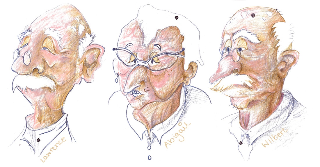 (A4 drawings, watercolour and coloured pencils)
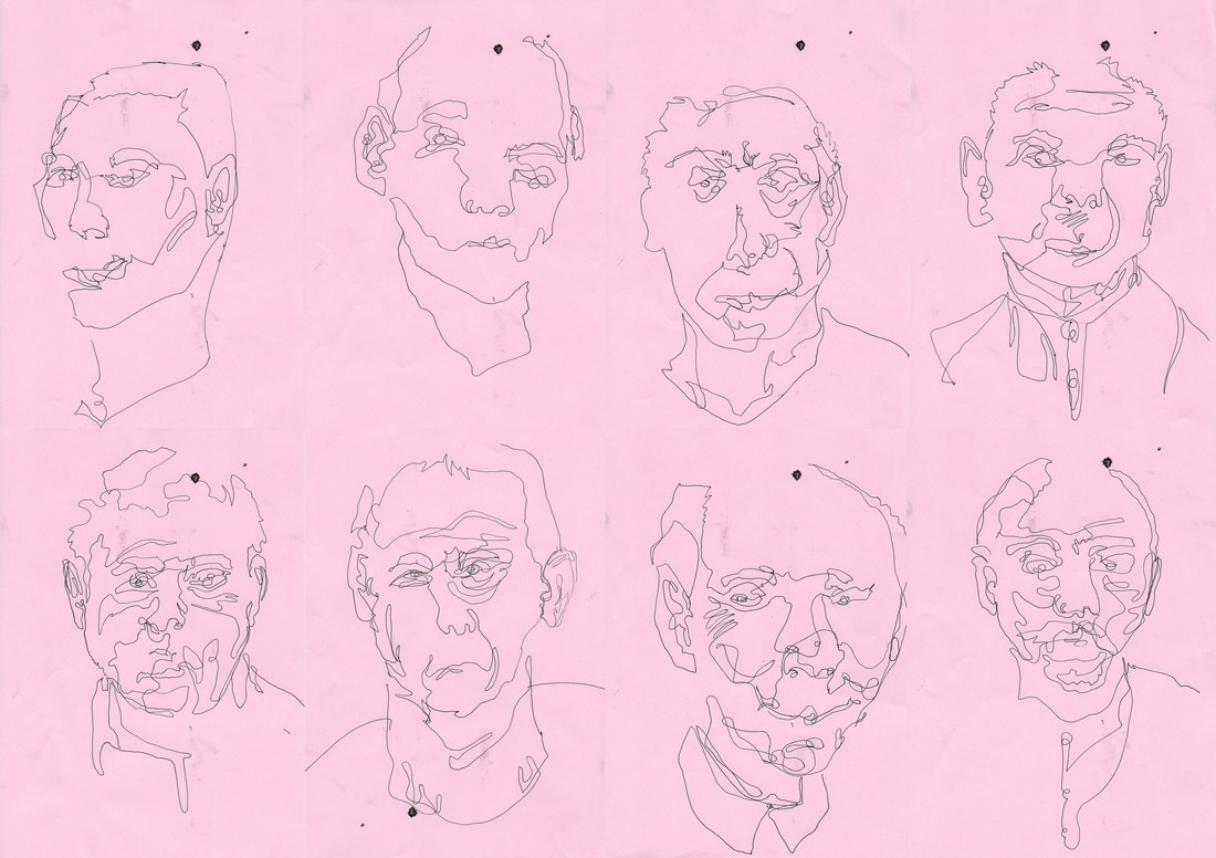
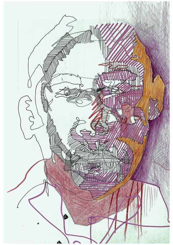
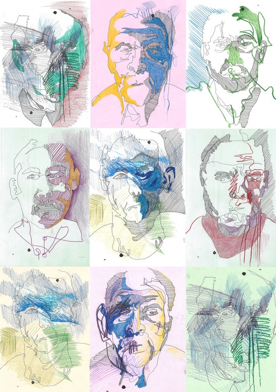
I think that those illustrations would look very interesting if I made them into animations as they have very specific face features. I can image how they would sound and how they would move. I hope that I distinguished their personalities through their face expressions. I though that it would be appropriate to do quick printing as it fits with the idea of storms and hurricanes. It's hard to control how dark or light the image would be therefore it is unpredictable just like weather. I think that messy line work and continuous line drawings were more apprioprate to show the personalities of the hurricanes.
I think that if it comes to a book or newspaper it is more acceptable to have bigger variety of styles and techniques as even though it is all put into one you don't see all of the pages at the same time. When you lay out loose pages on the table it might not all flow together nicely but when you see it in a book you concentrate on one bit at a time. When you flip the page you forget what you have seen on the previous pages and just look at what is in front of you. Here are some of the comments given by the rest of the class. I have to say that I don't and do agree with some of them. It's always good to see how other people see your work and how they interract with it. I would definitely take in consideration some of the ideas given to us but I would also make sure to stick to the rough idea that we came up with in the first place. We have planned some of the layouts for the newspaper so that there is enough text as well as images. We wanted it to be more visual than just plain information which is why there are mainly images. The size definitely had an impact on how people interacts with it. We have decided to collaborate on the front cover to join all of our styles and different techniques. 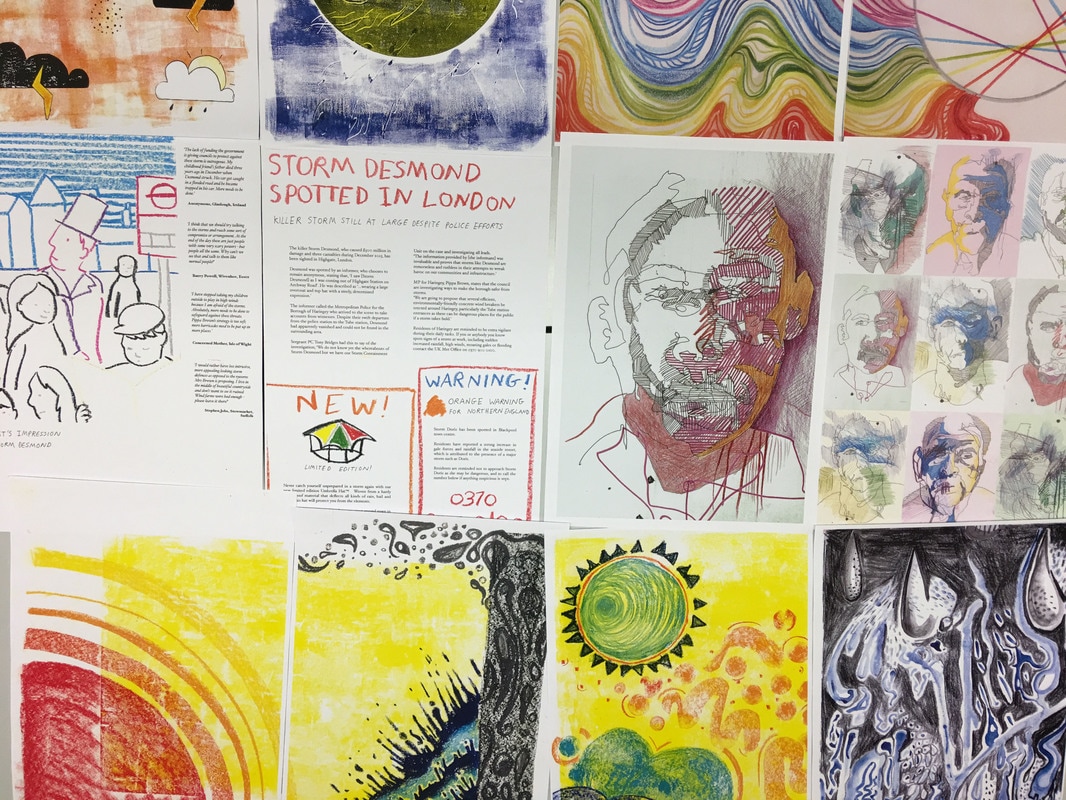 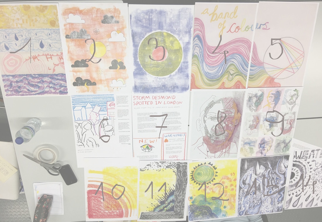 I think that when you look at all the pages at once it doesn't look as impressive because of the clashing styles. I feel like there is too much going on. But when you put it in a book format it separates all the pages and makes it less busy.
Here are some of the objects that my group has made based on different aspects of the weather. We have decided to show the fabric in motion because of the movement of the material and the way it flows. People wouldn't see them the same as if they were just laying on the flat table. I think that acting and moving in the right way is as important as the objects itself because it completes the whole image. White coat made by Louise was based on rain and thunder. When she was wearing it and spinning around all of the drawn rain drops were less visible and smudged, which is how we see rain in real life. Rain or rain drops can't be defined as one shape when you look at it from far.
I found it interesting how we all gave each other the same task but approached it in very personal way. In this project I think it is important that we narrow down the ideas and stick to one simple thought. More: https://www.instagram.com/p/BRspx_vgv3a/?taken-by=louisemayfitz https://lucydaltondraws.tumblr.com https://www.tumblr.com/search/beth-briib |
Archives
May 2017
Categories |


 RSS Feed
